When word spread that the Cornerhouse would be closing its doors after 35 years and relocating to fresher pastures, in the process metamorphosing into HOME, the overwhelming reaction from those around me was dismay.
Every Mancunian I met seemed to have a story, a unique personal connection to Cornerhouse – people who had met the love of their life at the bar, parted ways with friends in disagreements over director’s styles, or drank their first good cappuccino.
And a special mention for the woman who had her first sexual experience whilst trying to cling to the plot of Mulholland Drive .
I remember deeply embarrassing my friend as I drunkenly sobbed at the credits of The Grand Budapest Hotel .
<span>HOME</span><span>Art-itecture!</span><span>No denying even the outside of HOME is a sight to behold</span><span>flash</span><span> 16</span><span>cameramake</span><span> Canon</span><span>height</span><span> 3456</span><span>orientation</span><span> 1</span><span>camerasoftware</span><span> Adobe Photoshop CS4 </span><span>originaldate</span><span> 5/29/2015 9:59:17 PM</span><span>width</span><span> 4272</span><span>cameramodel</span><span> Canon EOS 600D</span><span>Nothing to hate…</span><span>HOME is clean and beautiful, but not exactly homely</span><span>flash</span><span> 16</span><span>cameramake</span><span> Canon</span><span>height</span><span> 3456</span><span>orientation</span><span> 1</span><span>camerasoftware</span><span> Adobe Photoshop CS4 </span><span>originaldate</span><span> 5/29/2015 9:58:56 PM</span><span>width</span><span> 5184</span><span>cameramodel</span><span> Canon EOS 600D</span><span>Sense of purpose</span><span>The concrete space between buildings lacks atmosphere</span><span>flash</span><span> 16</span><span>cameramake</span><span> Canon</span><span>height</span><span> 3456</span><span>orientation</span><span> 1</span><span>camerasoftware</span><span> Adobe Photoshop CS4 </span><span>originaldate</span><span> 5/29/2015 9:56:39 PM</span><span>width</span><span> 5184</span><span>cameramodel</span><span> Canon EOS 600D</span><span>Settling in</span><span>Mecanoo’s innovative £20million curving design fits in its surroundings</span><span>flash</span><span> 9</span><span>cameramake</span><span> Canon</span><span>height</span><span> 3456</span><span>orientation</span><span> 1</span><span>camerasoftware</span><span> Adobe Photoshop CS4 </span><span>originaldate</span><span> 5/29/2015 9:56:07 PM</span><span>width</span><span> 5184</span><span>cameramodel</span><span> Canon EOS 600D</span><span>Mirrored Manchester</span><span>The glass exterior is striking, especially while the sun is out</span><span>cameramake</span><span> Canon</span><span>height</span><span> 3456</span><span>orientation</span><span> 1</span><span>camerasoftware</span><span> Adobe Photoshop CS4 </span><span>originaldate</span><span> 5/29/2015 9:55:49 PM</span><span>width</span><span> 5184</span><span>cameramodel</span><span> Canon EOS 600D</span><span>Curvaceous constant</span><span>We’ve not lost the Cornerhouse cylinder we’d grown to love</span><span>cameramake</span><span> Canon</span><span>height</span><span> 3456</span><span>orientation</span><span> 1</span><span>camerasoftware</span><span> Adobe Photoshop CS4 </span><span>originaldate</span><span> 5/29/2015 9:55:16 PM</span><span>width</span><span> 5184</span><span>cameramodel</span><span> Canon EOS 600D</span><span>What a contrast!</span><span>Modernist First Street stands surrounded by battered red-brick buildings</span><span>cameramake</span><span> Canon</span><span>height</span><span> 3456</span><span>orientation</span><span> 1</span><span>camerasoftware</span><span> Adobe Photoshop CS4 </span><span>originaldate</span><span> 5/29/2015 9:54:48 PM</span><span>width</span><span> 5184</span><span>cameramodel</span><span> Canon EOS 600D</span><span>HOME is where the art is</span><span>The ground floor consists of a gallery, gift shop, box office and bar </span><span>flash</span><span> 16</span><span>cameramake</span><span> Canon</span><span>height</span><span> 3456</span><span>orientation</span><span> 1</span><span>camerasoftware</span><span> Adobe Photoshop CS4 </span><span>originaldate</span><span> 5/29/2015 10:07:25 PM</span><span>width</span><span> 5184</span><span>cameramodel</span><span> Canon EOS 600D</span><span>Element of discovery </span><span>HOME really delivers even in a relatively small space</span><span>flash</span><span> 16</span><span>cameramake</span><span> Canon</span><span>height</span><span> 3456</span><span>orientation</span><span> 1</span><span>camerasoftware</span><span> Adobe Photoshop CS4 </span><span>originaldate</span><span> 5/29/2015 10:07:08 PM</span><span>width</span><span> 3852</span><span>cameramodel</span><span> Canon EOS 600D</span><span>Touch of wonder</span><span>Whilst not all of it is ‘high-art’, each piece stimulated a deep personal response</span><span>flash</span><span> 16</span><span>cameramake</span><span> Canon</span><span>height</span><span> 3456</span><span>orientation</span><span> 1</span><span>camerasoftware</span><span> Adobe Photoshop CS4 </span><span>originaldate</span><span> 5/29/2015 10:06:28 PM</span><span>width</span><span> 5184</span><span>cameramodel</span><span> Canon EOS 600D</span><span>Welcoming </span><span>Despite all my doubts, I started to warm to the new centre</span><span>flash</span><span> 16</span><span>cameramake</span><span> Canon</span><span>height</span><span> 3456</span><span>orientation</span><span> 1</span><span>camerasoftware</span><span> Adobe Photoshop CS4 </span><span>originaldate</span><span> 5/29/2015 10:03:32 PM</span><span>width</span><span> 5184</span><span>cameramodel</span><span> Canon EOS 600D</span><span>Hanging lamps and exposed concrete </span><span>The atmosphere is reminiscent of the old Cornerhouse without quite being a parody of it</span><span>flash</span><span> 16</span><span>cameramake</span><span> Canon</span><span>height</span><span> 3456</span><span>orientation</span><span> 1</span><span>camerasoftware</span><span> Adobe Photoshop CS4 </span><span>originaldate</span><span> 5/29/2015 10:01:45 PM</span><span>width</span><span> 5184</span><span>cameramodel</span><span> Canon EOS 600D</span><span>Artisan popcorn</span><span>Cornerhouse’s speciality arthouse films are back on offer, but with a little extra</span><span>flash</span><span> 16</span><span>cameramake</span><span> Canon</span><span>height</span><span> 3456</span><span>orientation</span><span> 1</span><span>camerasoftware</span><span> Adobe Photoshop CS4 </span><span>originaldate</span><span> 5/29/2015 10:01:25 PM</span><span>width</span><span> 5184</span><span>cameramodel</span><span> Canon EOS 600D</span><span>Packed out </span><span>It was clear we were not going to get a table at the restaurant </span><span>flash</span><span> 16</span><span>cameramake</span><span> Canon</span><span>height</span><span> 3456</span><span>orientation</span><span> 1</span><span>camerasoftware</span><span> Adobe Photoshop CS4 </span><span>originaldate</span><span> 5/29/2015 10:00:52 PM</span><span>width</span><span> 5184</span><span>cameramodel</span><span> Canon EOS 600D</span><span>Full of surprises</span><span>Open space of the main gallery is contradicted with dark corners and secret corridors</span><span>flash</span><span> 16</span><span>cameramake</span><span> Canon</span><span>height</span><span> 3456</span><span>orientation</span><span> 1</span><span>camerasoftware</span><span> Adobe Photoshop CS4 </span><span>originaldate</span><span> 5/29/2015 10:17:28 PM</span><span>width</span><span> 5184</span><span>cameramodel</span><span> Canon EOS 600D</span><span>Colour and life</span><span>A real sense of life exudes from the pieces, especially the video and installation works</span><span>flash</span><span> 16</span><span>cameramake</span><span> Canon</span><span>height</span><span> 3456</span><span>orientation</span><span> 1</span><span>camerasoftware</span><span> Adobe Photoshop CS4 </span><span>originaldate</span><span> 5/29/2015 10:09:56 PM</span><span>width</span><span> 5184</span><span>cameramodel</span><span> Canon EOS 600D</span><span>Exploration</span><span>Feelings of love and loss in the uncertain world of our contemporary society</span><span>flash</span><span> 16</span><span>cameramake</span><span> Canon</span><span>height</span><span> 3352</span><span>orientation</span><span> 1</span><span>camerasoftware</span><span> Adobe Photoshop CS4 </span><span>originaldate</span><span> 5/29/2015 10:09:47 PM</span><span>width</span><span> 5100</span><span>cameramodel</span><span> Canon EOS 600D</span><span>Inescapably intertwined</span><span>We are the generation of heartbreak and technology </span><span>flash</span><span> 16</span><span>cameramake</span><span> Canon</span><span>height</span><span> 3456</span><span>orientation</span><span> 1</span><span>camerasoftware</span><span> Adobe Photoshop CS4 </span><span>originaldate</span><span> 5/29/2015 10:08:12 PM</span><span>width</span><span> 5184</span><span>cameramodel</span><span> Canon EOS 600D</span><span>Feelings not a question of taste</span><span>And HOME gives you an arena to argue about them all evening</span><span>flash</span><span> 16</span><span>cameramake</span><span> Canon</span><span>height</span><span> 3456</span><span>orientation</span><span> 1</span><span>camerasoftware</span><span> Adobe Photoshop CS4 </span><span>originaldate</span><span> 5/29/2015 10:07:48 PM</span><span>width</span><span> 5184</span><span>cameramodel</span><span> Canon EOS 600D</span><span>Sense of displacement </span><span>Who hasn’t felt disconnected and alone after a long session on social media?</span><span>flash</span><span> 16</span><span>cameramake</span><span> Canon</span><span>height</span><span> 3456</span><span>orientation</span><span> 1</span><span>camerasoftware</span><span> Adobe Photoshop CS4 </span><span>originaldate</span><span> 5/29/2015 10:31:55 PM</span><span>width</span><span> 5184</span><span>cameramodel</span><span> Canon EOS 600D</span><span>Up for debate</span><span>Fundamentally art is nothing without conflicting emotions and opinions</span><span>flash</span><span> 16</span><span>cameramake</span><span> Canon</span><span>height</span><span> 3456</span><span>orientation</span><span> 1</span><span>camerasoftware</span><span> Adobe Photoshop CS4 </span><span>originaldate</span><span> 5/29/2015 10:23:57 PM</span><span>width</span><span> 5184</span><span>cameramodel</span><span> Canon EOS 600D</span><span>Emptiness</span><span>Outside is bare because everyone is inside eating, drinking and absorbing art</span><span>flash</span><span> 16</span><span>cameramake</span><span> Canon</span><span>height</span><span> 3456</span><span>orientation</span><span> 1</span><span>camerasoftware</span><span> Adobe Photoshop CC 2</span><span>originaldate</span><span> 5/29/2015 9:57:25 PM</span><span>width</span><span> 5184</span><span>cameramodel</span><span> Canon EOS 600D</span><span>New and shiny</span><span>Who knows whether HOME will achieve the same iconic status as Cornerhouse?</span><span>flash</span><span> 16</span><span>cameramake</span><span> Canon</span><span>height</span><span> 3456</span><span>orientation</span><span> 1</span><span>camerasoftware</span><span> Adobe Photoshop CC 2</span><span>originaldate</span><span> 5/29/2015 10:00:40 PM</span><span>width</span><span> 5184</span><span>cameramodel</span><span> Canon EOS 600D</span><span>Welcome HOME</span><span>To shun the new complex out of a misplaced sense of loyalty or nostalgia is self-defeating</span><span>flash</span><span> 16</span><span>cameramake</span><span> Canon</span><span>height</span><span> 3456</span><span>orientation</span><span> 1</span><span>camerasoftware</span><span> Adobe Photoshop CC 2</span><span>originaldate</span><span> 5/29/2015 9:59:05 PM</span><span>width</span><span> 5184</span><span>cameramodel</span><span> Canon EOS 600D</span><span>Cornerhouse is dead</span><span>It’s time to embrace the new, and support inspiration and imagination in all its forms</span><span>cameramake</span><span> Canon</span><span>height</span><span> 3456</span><span>orientation</span><span> 1</span><span>flash</span><span> 16</span><span>originaldate</span><span> 5/29/2015 10:41:09 PM</span><span>width</span><span> 5184</span><span>cameramodel</span><span> Canon EOS 600D</span><span>Long live HOME</span><span>Ultimately what Cornerhouse offered – the films, the art – HOME gives in abundance</span><span>cameramake</span><span> Canon</span><span>height</span><span> 3456</span><span>orientation</span><span> 1</span><span>flash</span><span> 16</span><span>originaldate</span><span> 5/29/2015 10:44:54 PM</span><span>width</span><span> 5184</span><span>cameramodel</span><span> Canon EOS 600D</span><span>Opening exhibition</span><span>The heart is deceitful above all things, and desperately sick; who can understand it?</span><span>cameramake</span><span> Canon</span><span>height</span><span> 3456</span><span>orientation</span><span> 1</span><span>flash</span><span> 16</span><span>originaldate</span><span> 5/29/2015 10:47:00 PM</span><span>width</span><span> 5184</span><span>cameramodel</span><span> Canon EOS 600D</span><span>Cautiously complimentary</span><span>My friend said she preferred HOME to the newly revamped Whitworth</span><span>cameramake</span><span> Canon</span><span>height</span><span> 3456</span><span>orientation</span><span> 1</span><span>flash</span><span> 16</span><span>originaldate</span><span> 5/29/2015 10:53:11 PM</span><span>width</span><span> 5184</span><span>cameramodel</span><span> Canon EOS 600D</span><span>Discover its treasures</span><span>A trip HOME is highly recommended</span><span>cameramake</span><span> Canon</span><span>height</span><span> 3456</span><span>orientation</span><span> 1</span><span>flash</span><span> 16</span><span>originaldate</span><span> 5/29/2015 10:54:02 PM</span><span>width</span><span> 5184</span><span>cameramodel</span><span> Canon EOS 600D</span>
Even for those who couldn’t care less about visual arts, foreign cinema or arthouse cult films, the move seemed symbolic of the death of Manchester’s icons, a final nail in the coffin of ‘Madchester’.
People likened it to the end of the Hacienda, or the Warehouse Project going mainstream. All that mattered was that another Manc bastion was being boarded up.
How, we asked, could any glass-plated new development compete with David Chipperfield’s archetypal illuminated cylinder, drawing you in with the names of weird and wonderful unknowns?
No-one really seemed to hold out much hope for HOME. And frankly neither did I.
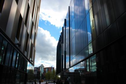
MIRRORED MANCHESTER: The glass exterior is striking, especially while the sun is out
Despite all the hype, and the many new road signs pointing you in its direction, I avoided the carnival opening night and the first weeks of shows.
Perhaps I was being a cultural chauvinist, but I felt unmoved to visit a building so swarmed with people desperate to see, and be seen at Manchester’s new artistic hub.
Eventually curiosity got the better of me and I caved. Together with my most judgemental friend I embarked on a tour of HOME and its new location on First Street.
What initially struck me was the emptiness.
EMPTINESS: Outside is bare because everyone is inside eating, drinking and absorbing art
Despite Manchester’s growing reputation as a business and economic hub, behind the gleaming steel and mirrored glass of many of its new developments there’s a sense that these buildings have been abandoned and left to decay.
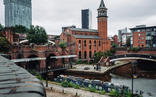
Modernist First Street stands surrounded by battered red-brick buildings, and the contrast between the two styles was striking.
Surprisingly, from an architectural standpoint there’s nothing to hate.
I’m used to new Manchester urban projects being characterised by their lack of character – typically a classic factory is bulldozed to be replaced by a soulless and boring combination of six-storey bland brickwork and tinted double glazing.
CURVACEOUS CONSTANT: We’ve not lost the Cornerhouse cylinder we’d grown to love
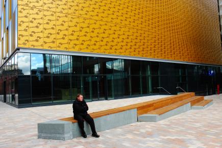
Instead award-winning Dutch company Mecanoo’s innovative £20million curving design for HOME sits neatly amongst Ian Simpson Architects’ dramatic ‘Innside’ hotel and a futuristic yet organically stylised yellow car park – one of the best looking I’ve ever seen.
Overall the environment is clean and beautiful, but not exactly homely.
As we walked across the five hundred metre concrete space between the buildings a few dozen people ambled aimlessly from one side to another.
I suppose some were working, some visiting the new complex but generally the whole atmosphere lacked a sense of purpose.
NO SENSE OF PURPOSE: The concrete space between buildings lacks atmosphere
Stepping foot in HOME, we suddenly discovered where all the missing people were.
Even on a weekday afternoon the interior was packed and dynamic, students mixing in with families, middle-aged couples and elderly critics chatting, drinking and laughing – almost overwhelming after the silence of outside.
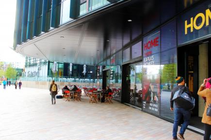
The ground floor consists of a gallery, gift shop, box office and bar which surround an MC Escher style wooden staircase.
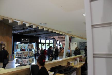
I found the atmosphere to be reminiscent of the old Cornerhouse without quite being a parody of it, the hanging lamps and exposed concrete expressive of functionality rather than pretention.
REMINISCENT: Hanging lamps and exposed concrete remind us of Cornerhouse without being a parody
Up to the next floor, and we enter a packed out restaurant with people stood queuing for tables, more hanging lamps and a wall of modern pop art.
It’s clear we’re not going to get a table so after a quick nose about the empty theatres, we move up to the cinema floor where the Cornerhouse’s speciality arthouse films are back on offer, but this time with added artisan popcorn.
The atmosphere was welcoming and despite all my doubts, I started to warm to the new centre.
However my dogmatic distrust was not so easily dispelled, so I left it up to the experience of the new gallery to be the deciding factor in whether HOME had hit home.
OPENING EXHIBITION: The heart is deceitful above all things, and desperately sick; who can understand it?
The opening exhibition, entitled The Heart is Deceitful Above All Things, runs from 22 May 2015 –26 July, and is named after a Bible quote which follows: ‘ The heart is deceitful above all things, and desperately sick; who can understand it?’ Jeremiah 17:9.
It features artists such as new media artist Jeremy Bailey, contemporary film, performance and installation artists Wu-Tsang with Alexandro Segade, and multi-media artist Gemma Parker who specialises in portraying burlesque.
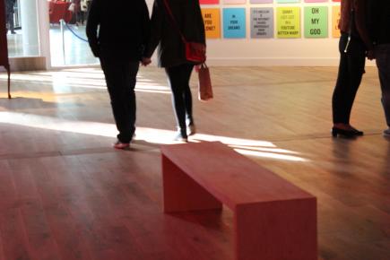
Roughly horse-shoe shaped, as we traversed the exhibition the clean lines and open space of the main gallery room were contradicted with unexpected dark corners and secret corridors.
Every good gallery should have an element of discovery to it, and HOME manages to deliver this even in a relatively small space.
ELEMENT OF DISCOVERY: HOME really delivers even in a relatively small space
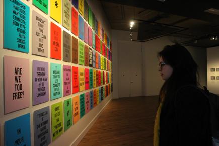
I was left a little lost by an interactive work which let you use iPhones to mimic scythes and hammers, but what struck me most was the colourfulness of the majority of the work, and the real sense of life that exuded from the pieces, especially the video and installation works.
The HOME website sums up the exhibition as an exploration of ‘feelings of love and loss in the uncertain world of our contemporary society’, and for once the blurb actually told the truth.
For my generation heartbreak and technology are inescapably intertwined, and this was reflected in so many of the pieces displayed.
Uncertainty, a sense of displacement – who hasn’t felt disconnected and alone after a long session on social media?
EXPLORATION: Feelings of love and loss in the uncertain world of our contemporary society
My friend said she preferred HOME to the newly revamped Whitworth, and I was tempted to agree.
There was a rawness to it that differed from some of the overly-produced aspects of the Whitworth, and whilst not all of it may be considered ‘high-art’, each piece stimulated a deep personal response.
Although this is not always the same response, a video work that I found powerful and emotional, my friend branded as ‘pointless and annoying’ but fundamentally art is nothing without debate.
Feelings are not a question of taste and HOME gives you the arena to argue about them all evening long.
FEELINGS NOT A QUESTION OF TASTE… And HOME gives you an arena to argue about them all evening
Maybe HOME will never achieve the same icon status as Cornerhouse, or become a defining landmark on the Manchester map.
I’m not sure it matters. Ultimately what Cornerhouse offered – the films, the art – HOME gives in abundance, and with added live theatre and with space for many more to discover its treasures.
To shun the new complex out of a misplaced sense of loyalty or nostalgia is self-defeating – it only hurts the artists, writers and creators.
It’s time to embrace the new, and continue to support inspiration and imagination in all its forms. Cornerhouse is dead, long live HOME.
LONG LIVE HOME: Ultimately what Cornerhouse offered – the films, the art – HOME gives in abundance
